GRAPHIC DESIGN
•
GRAPHIC DESIGN •
Driftwood Bar
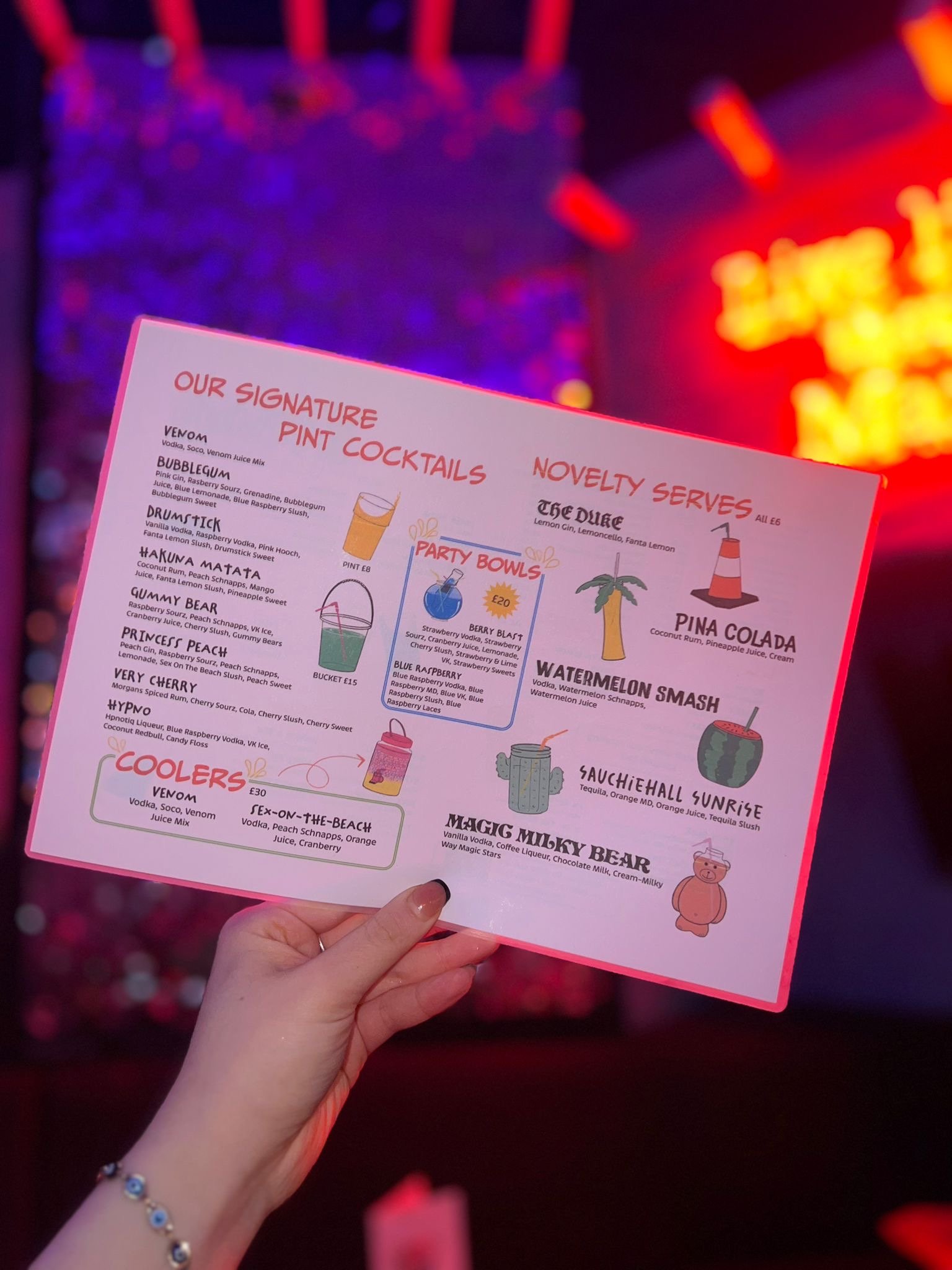
Driftwood is a vibrant and spunky bar located in Glasgow, Scotland with an electric atmosphere. The client wanted to replicate that feeling through doodles of the drink cups, exciting colors, and unique typography.
I had the opportunity to create the layout of their new menu and illustrate all the drinks that complement each section.
Client
Driftwood Bar
Year
2024
Camp Don Lee
I have worked with Camp Don Lee since 2020- creating shirts, paintings,
and other merchandise.
Camp Don Lee is a nonprofit summer, retreat, and environmental educational camp that teaches the importance of love for our neighbor and nature.
Client
Camp Don Lee
Year
2020-Present
In 2023 when I worked at Camp Don Lee as their Creative Coordinator, I designed promotional designs for their 75th anniversary. These designs were used for staff, camper, and alumni shirts, patches, hats, and other merchandise. They were also used for social media promotions.
Redesigned the map of the camp to make locations easier to access for new campers and retreat groups.
While designing the map, I kept in mind what is important to Camp Don Lee. With that being said, on the map I hid different animals from around camp as a search and find.
“What’s in a name” signifies what about us makes us unique. For this design, everything inside the bubble letters is what makes Camp Don Lee, Camp Don Lee.
From friendship to sailing, a campfire at night; it is all represented what makes us unique.
One of the first projects I did for Camp Don Lee was a watercolor painting of the main locations around the camp. It included their sailing center, the pool, their pier that has withheld numerous hurricanes, and all the boats they provide.
This original watercolor painting was used as a print that is hanging in many camper, doner, and alumni homes, as well as a Christmas ornament.


